Yellow and Grey Double Color Theme for 2021
Blog Contents
The trends for the upcoming year have been unveiled, and the message that they are conveying is optimism. Pantone color of the year 2021 is actually a combination of two independent but complementary colors – PANTONE 17-5104 Ultimate Gray and PANTONE 13-0647 Illuminating. As they come from different palettes and typically are used to represent different moods, this pair demonstrates what humanity is currently striving for: mutual support and acceptance. While Illuminating is cheerful and lively, Ultimate Gray is solid, persistent and neutral. Two different worldviews come together in the team of two, encompassing challenges of the undeniably difficult year, that we are yet to finally overcome.

Yellow and Gray Interior Design Around the Globe
Like yin and yang, Illuminating and Ultimate Gray seek balance. Perseverance and firmness have less value without some joy. Likewise, any true vivacity cannot exist without a pinch of being down-to-earth. After monotonous and, at the same time, emotional 2020, people are looking for a balanced combination of these two opposites. Our home settings or workplace are the first things where we influence our mood by playing with colors. Let’s see how designers from all over the world combine Illuminating and Ultimate Gray.
LEGO Office, Shanghai.
LEGO uses yellow that corresponds with its corporate style: bright construction toys, friendly to any age and gender. This friendliness is smoothly transmitted to the lounge and conference rooms. However, shades of gray keep reminding everyone that it is still a place for professionals who take their job seriously.


Yellow and Gray Room Decor MIT Beaver Works, Cambridge
MIT students and faculties are professionals who value concentration and precision. Gray is an epitome of those qualities. At the same time, everyone needs a sense of positivity and creativity to maintain effectiveness. This color combination in such an advanced institute not only has interior design value but practical application as well.


Kleinerdrei, Hamburg
Playful yellow is what kids need in a kindergarten. All furniture is designed in yellow to attract and entertain toddlers as much as possible. Still, Kleinerdrei is located in a multi-functional building, so gray walls and doors maintain the surroundings’ neutrality to match adjacent shops and midwifery rooms.


Color Trends and Architectural Film Applications.
Let’s be honest, color of the year changes every year, so do trends. Does any person or company update their interiors on an annual basis according to what trendsetters say? Unlikely. They can find some inspiration, though. A yellow-gray theme will encourage many commercial and residential interior designers to dilute old settings with something that feels up-to-date and relatable. When it comes to partial renovation, most of us will stop as it always costs a fortune. Imagine MIT Beaver Works, mentioned above, changing the entire furniture.
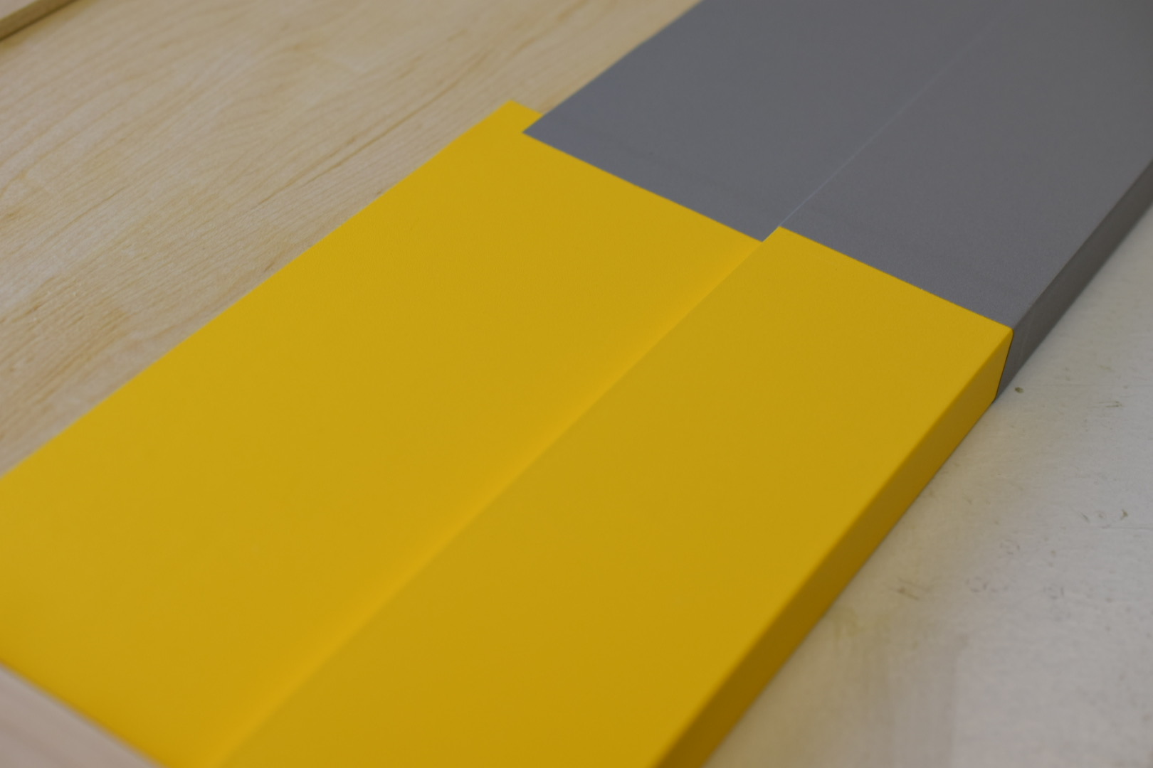
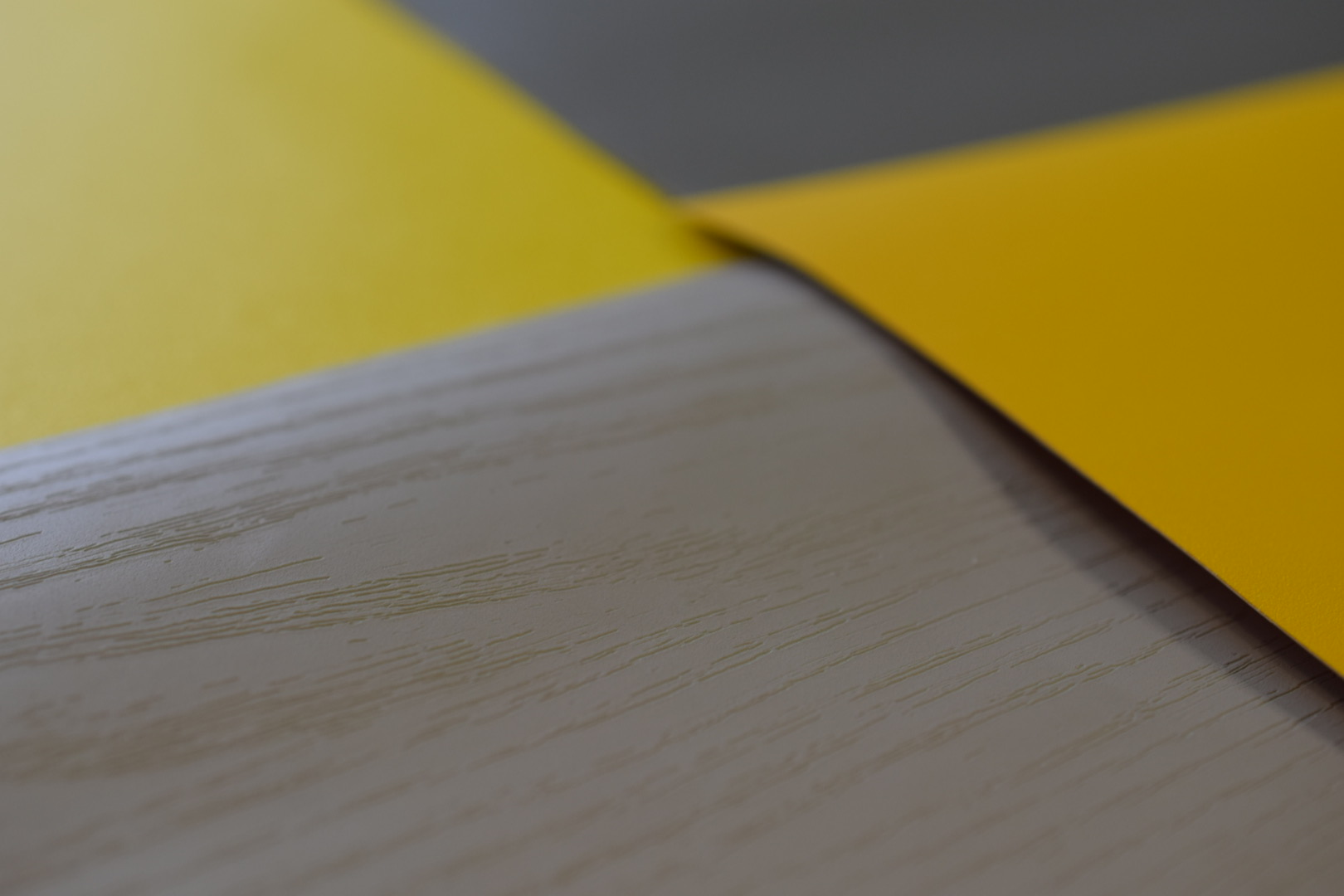
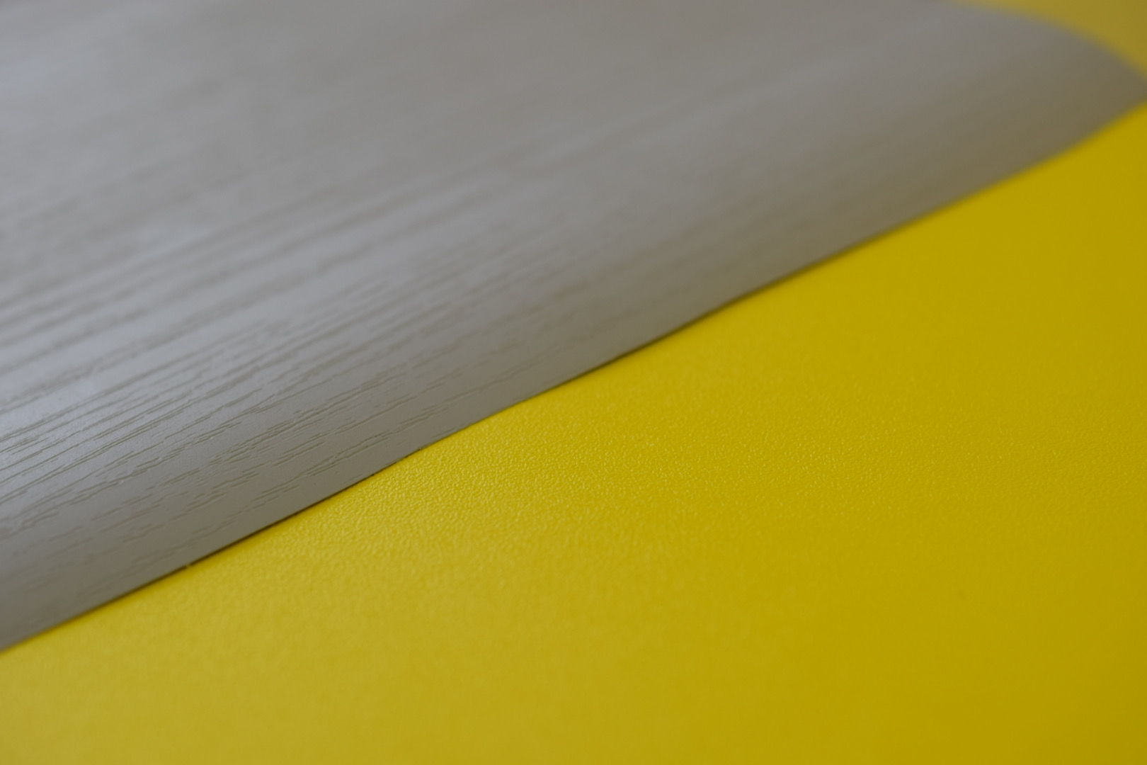
As interior film is quite a new-to-market product, not everyone is familiar with it. It is a vinyl film that completely imitates patterns and textures of natural materials. It’s hard to come up with natural yellow surfaces, but gray wood is pretty common. Combining these two in one interior solution can be revolutionary.
Some of architectural film patterns
Have a look at a wardrobe picture below: a perfect fit into neutral shades of gray and brown. Now imagine that you already have this wardrobe, but it’s plain white. Buying a custom yellow version to have a desirable color match? Probably not – no one likes to pay extra. Covering it with Dandelion Yellow Interior Film from our Solid Collection? It is much better: you would hundreds of dollars and do the refinishing as quickly as an actual replacement would be.

Benefits for Designers.
The architectural film is easy to use. Highly durable, damage-resistant, it is a state-of-the-art solution in interior design, whether there are plans to update a small detail in the interior or renovate the entire room.
How refinishing with Bodaq interior film can be helpful for those who got hooked by the upcoming double color trend:
- It applies to any form of solid surfaces: walls, furniture, appliances, panels, you name it;
- Affordable: much cheaper than buying new interior objects;
- Durable: people who are going to use refinished interiors won’t complain about scratches or any other damages for at least five years;
- Infinite combinations: more than 30 shades of gray and yellow patterns with different textures: solid, marble, wood, stone.
In the end, the new color theme is all about positivity and strength: strong positivity and positive strength simultaneously. An intention to add such qualities into our lives is commendable, indeed. And with the Bodaq architectural film, also easily achievable.
FAQ about yellow and gray colors in interior design
Can grey and yellow go together?
Yes, yellow and gray go well together, creating a cheerful yet balanced look.
Do grey and yellow go together bedroom?
The combination of sunshine-yellow and neutral gray is already considered a classic one. You just need to choose the perfect shade of both colors for your bedroom.
How do you decorate a gray and yellow living room?
Yellow makes a great pop of color whether it is a piece of decor, like couch pillows, or furniture, like cozy accent chairs.
Grays tone down the vibrancy of yellows, and yellows give cool-toned grays a lift. So, choose which color will be dominant in your interior and play with it till you like what you have.
What shade of gray goes with yellow?
Most tones of both colors go well together, but for a better combination opt for the light gray – light yellow, dark gray – bold yellow, and so on.


