A Closer Look At The Super Matte Collection.
Table of Contents
Many people’s attitude to life has changed in 2020, and so has their emphasis on interior design. We already articulated a duality search for optimism and firmness to be reflected in the interiors (read our Pantone analysis). There are also tons of articles on how sunny hues and minimalism affect design solutions.
Instead, we’d like to focus on a narrower topic – which matte colors are staying trendy, why people are choosing them, and why you should consider them. Here is the breakdown of matt interior design trends for 2021.
Deep Green Matte: putting black matte aside.
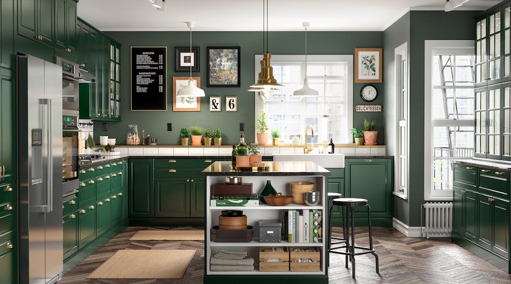
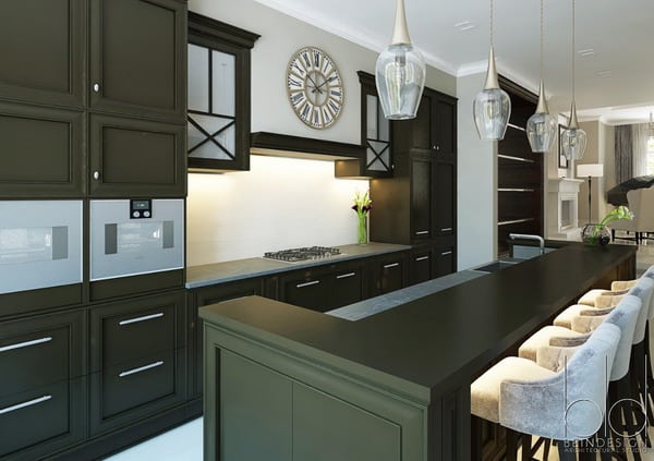
Many designers claim this mysterious deep shade of green to be a color of 2021. It is similar to the black matte but is not so loud in the entire environment set. Instead of catching all the attention, it accentuates non-green areas. The color combines yellow and blue, so it works perfectly in cold and warm palettes. As Insider correctly stated, it is an excellent pairing to Carrara or Arabescato marble countertops as it highlights gray veins in the stone. Another good thing about deep green is that it works perfectly with metals, from chrome to brass. And the kitchen is the space where you would find such accessories.
Bordeaux Matte: invoking emotions.
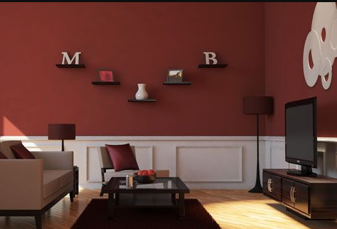
While matte green can cover an entire space without any problem, a room full of maroon is too much. Shades of red are very intensive, and so are the emotions they cause. That is why maroon-like colors, such as Super Matte Bordeaux, are an excellent choice for a romantic person or any art space, as its primary aim is to invoke emotions. Let’s be honest the pandemic isn’t going away anytime soon. People finally realized the importance of interior colors around them that relate to their moods. That is why applying different shades of maroon will still be in top demand in 2021.
Deep Blue Matte: bringing peace.
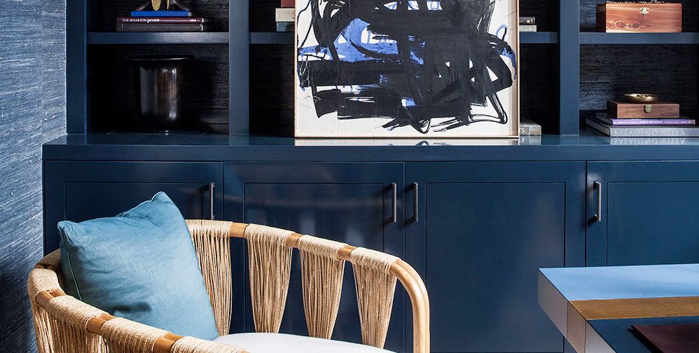
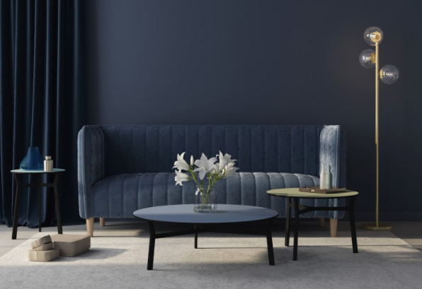
One may refrain from darker cues, thinking it will make a room gloomy and small. It all depends on how well your work with your interior shapes. Deep Blue Matte is no exception. A monochrome palette allows us to concentrate on the architectural details. Emboss on the sofa, lighting on the round table, and white flowers in the center – deep blue is calming and accentuating. Interior designers are still too attached to blue living rooms and bedrooms. And it’s understandable: this is the best color to bring a relaxing, close-to-trance atmosphere. If you feel a monochrome is too much, you can always soften it with white accents, like bardo, or add light blue accessories, like the pillows in the picture above.
More Matte Interior Design Ideas.
If you want more matte interior design ideas, explore our blog post on pattern collections (look into Solid Colors) or visit our pattern catalog.


