Get Away From the Fear of Using Color!
Table of Contents
Bring Color and Energy
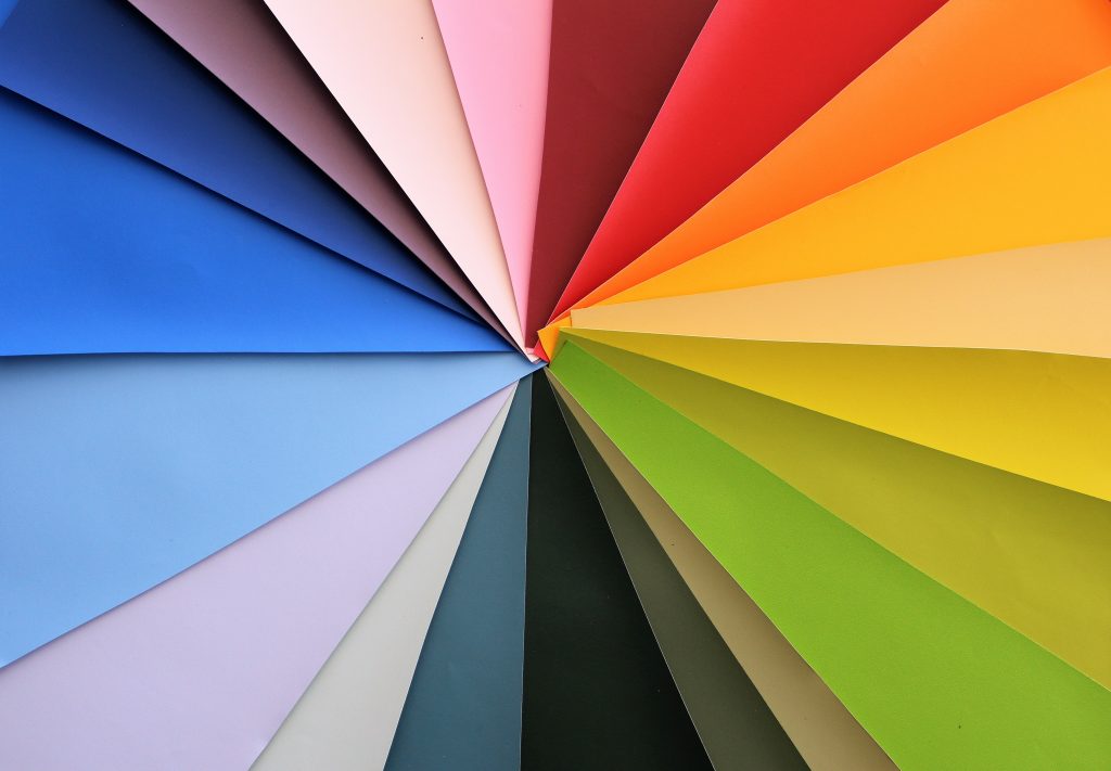
Colors have a remarkable quality – they tend to affect our emotional state. Therefore, make any space feel like a place where we want to stay, transform a house into a home. In recent years interior design trends were not very supportive of using bright colors. Maybe, a pop of color here and there, but mostly, preference was given to pastel tones, all whites, or some minimalistic muted tones of colors. Thankfully, the rest of 2021 and the year 2022 is really promising in using colors in interior design.
The current situation with working from home and being on lockdown has changed the way we see our homes. The so-called pandemic palette has been created by the necessity of bringing more joy to our lives locked in apartments for such a long period. Buoyant brights are optimistic through their clash of chaotic colors working together. You can also learn new ideas in our article about natural interior design style.
Say Goodbye to Monochromes
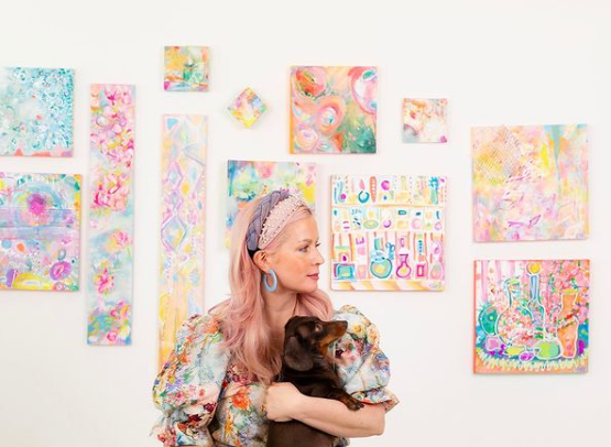
Tiffany Pratt, Canada’s Queen of Color, advises binding all the elements in a room with a bright color. Monochromatic spaces might look elegant but are very troublesome to live in. When everything around is decorated in monochrome colors, and it is also grey outside, life can seem pretty depressive. So it is time to leave white, greys, and pastels behind and bring color to your life. Not to mention how to use color psychology in interior design is a separate topic for discussion.
Mason & Objet Color Trend
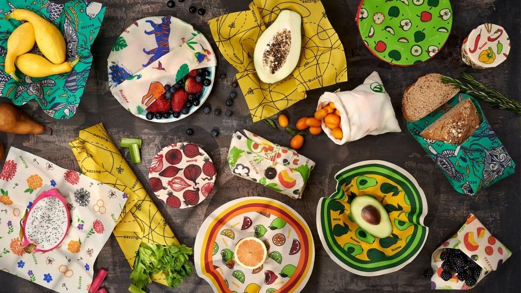
Patchwork, pop art, and swirls are a confident and cheerful addition to any space. This trend was manifested in the Mason & Objet exhibition, making it the main course for the upcoming months.
Pay attention to the colors you are bringing to your space – they do not have to match or look like they are on the first page of a fancy magazine. The only point of bringing color to your life is to make you feel better, more comfortable in your own home, without taking into account the opinions of others.
Bring Color Accents
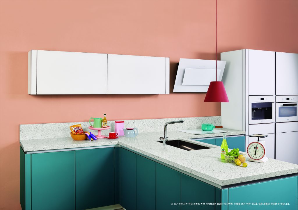
If you are not ready to go bold with colors, consider adding a pop of color in a single piece, feature wall, for example. It is where architectural films can come in handy. It is a fast and easy way to change the look of your walls without going through several days of putting paint coats or sticking wallpapers, inhaling all the odors and vapors of paint or glue.
There is a wide variety of architectural film patterns satisfying color demand; browse the catalog to find what you fancy.
Las Vegas Market Color Trend
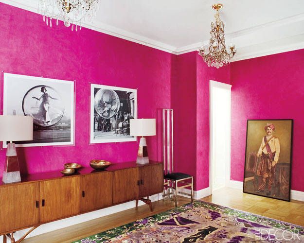
If you want to go further and implement the latest trend in your interior, you can go with the Las Vegas Market’s new color – bright pink. It is part of the 80s beats trend. So embrace your love of the 80s and bring pink back to your home. However, make sure you use the 2021 version of pink and not its older – millennial – type. In 2021, pink is brighter, bolder, and much louder. Do not be afraid of bringing this color to your home – it looks gorgeous and elevates the interior.
Finally, Pratt encourages you to have fun with house décor. Do not let fear of making a mistake paralyze you from taking risks – even if that means painting a whole room teal.
"In this life, it is the risk you do not take that maybe you will regret."
Tiffany Pratt Tweet


